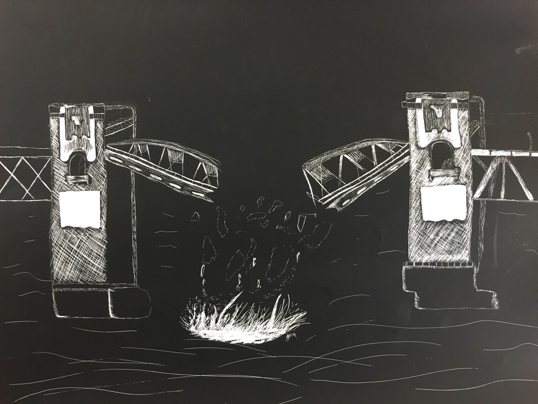
I Chose to do a breaking bridge so that way i could incorporate water into my piece. The idea i had in mind was that water would be great for this project but it turned out to be harder than i expected. It was a challenge using value to show the waves and the splash. It was also a challenge finding a way to separate the falling bridge pieces from the water splashes. i like the way the value in the bridge turned out, up close I couldn't really tell the changes in values but when i step back to look at it it's more visible. the pictures i got my inspiration from was a bridge, a helicopter (which is supposed to be in the top right corner), a whale jumping out of the water (to help me see giant splashes) , and the calm waves of the ocean. a tough part with this project that was new to me is not being able to erase afterward and barely using pencil. if i made a mistake i just had to make something out of it to fit in the picture. i should have done more with the background so that your eyes can travel over the whole thing instead of just the middle of the page and down. overall i think this was my best piece this semester.
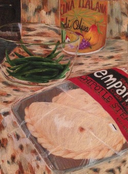
I loved Emmaly's opacity/transparency drawing because it all looks so realistic. i like how she placed an item in the foreground, middleground, and background. it gives your eye something to look at all over the paper. the glass bowl look really good even though she didn't have a lot of white in it which makes it look even more realistic. the wrapping with the chipotle stuff looks realistic as well and how you can see where the wrap folds. the colors in the background attracts your attention but doesn't overpower the main drawing. the colors on the items in the background and middleground seems duller than the item in the front which draws your eyes directly to the front before looking at the other items. overall it's a really nice piece.
2 mini lessons:
i enjoyed the lollipop drawing and felt it turned out really well. i usually work well with colors better than pencils so it was fun to use prisma. It helped me improve by seeing the shades and where to create the wrinkles in a wrapper. i also learned that there are more colors to help create shading instead of just using a solid color which will leave things looking flat.the directions for this project was pretty self-explanatory. it was straight to the point which is good. but still allowed room for creative expression seeing as everyone's came out differently.
i also enjoyed the candy unwrapping because it took the lollipop drawing to the next step and made a new challenge. it show the different angles of an object and the wrapper made different shadows with each time unwrapping it. the challenging part with that project is the writing on the candy. because you want to give them value to match the picture but it was so small. it was a fun project to do and opened my eyes to new objects i like to draw. the directions for this project was also direct and not confusing. i enjoyed the different options we had to choose from so everyone isn't drawing the same thing.
